 How to Use Tables and Figures in Academic Writing
Everyone has their own way of producing a table, or their own way of interpreting their data in a graphical way.
It also goes without saying that, for scientists and engineers, MATLAB produces far superior graphs to Excel, but does require some knowledge of programming. So, for many people, the simple interface of Excel is the common choice.
Graphs and tables are great ways to represent your data in a clear way, making it easier for your readers to digest complex data. Representation in this way can also help with word count regulations, as they are never included in the count.
Yet, there are many misconceptions of how a graph, or table, should be presented. This is often the case for undergraduate essays, dissertations, postgraduate theses and academic papers.
With this article, you should hopefully gain some new information into producing graphs and tables, which will allow you to produce clear graphs and tables before they reach review.
Unfortunately, many people do not get told how to go about presenting data, and more importantly, they don’t get shown. Many students go through their academic life producing data in an inadequate way, with the realization only coming when the student gets marked down in either their dissertation or thesis, or when a paper is rejected by a journal.
Legends vs titles
One thing that will get the focus of an academic reviewer, is how you tell your reader what your data is.
This may seem obvious to many of you, and, if it is, it is always good to have a refresher. Whilst it is a very basic concept, many students still put a title at the top of the graph in a textbox. Whilst academic researchers tend to have moved away from doing this, it is still prevalent with early-career researchers.
For academic manuscripts, the information about your graph should be underneath your figure, generally in italics (although this may depend on journal style), with a numerical value, e.g. Fig 2.1 preceding your description. This is not the same for tables, and is a common misconception.
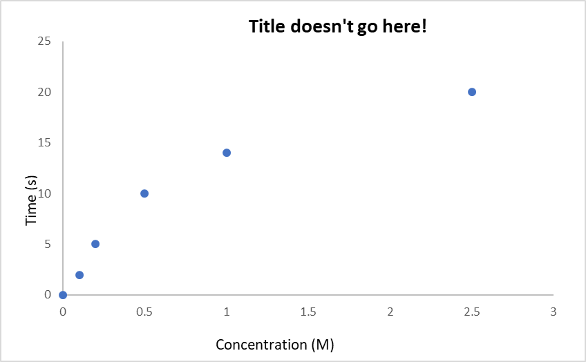
Fig 1.1.
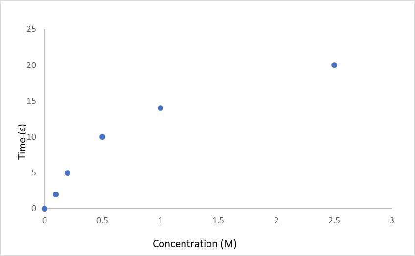
Fig 1.2. This is the correct way to produce a legend. How concentration of x solution changes with time.
Whilst one may think that tables follow the same rules as graphs, it is not the case, and the legend should precede, i.e. be above, the table.
One other fundamental consideration: do not put a graph and table in the main body of text within the same manuscript.
If you include a graph, it is acceptable, and common, to place its corresponding table into the appendix section. If you place a table into the results section, it would be assumed that the data are not applicable, or not well visually represented, in graph form. Only raw data and tabled data tend to occupy the appendix, i.e. non-refined data.
Above all, your graphs should be clear, precise and efficient in their data representation.
Formatting graphs
If you are an Excel user, it is better not to format your graph using the ‘default chart’ style. If you have a large representation of data, be it multiple sets or a set with close values, the lines are not very useful due to their large size/width.
If you want to make your graphs look more professional and clearer, use a smaller line size. Commonly, 0.75 pts is a good choice and it allows for the data points themselves to be clearly seen. Small fonts should also be used to maximise space, and an 8 pt font is large enough to be used in academic papers.
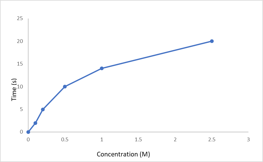
Fig 1.3. Showcasing the ‘default’ thick line.
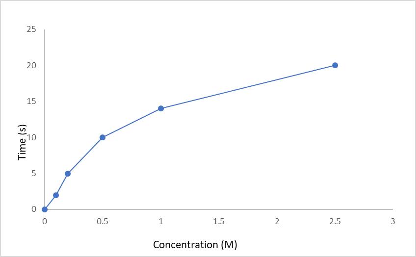
Fig 1.4. A much clearer 0.75 pt data line.
In scientific disciplines, unlike other subjects, you also have to consider error bars. If the results are borne out of experimental procedures, and not theoretical analyses, then the error of the equipment used needs to be included in your graphs.
It is also imperative to choose the right kind of error. There are three types that are commonly used:
- a standard predefined value,
- a percentage, and
- a standard deviation.
Regardless of whichever one you choose, it is crucial to keep the type errors for each data set in the graph the same! Otherwise your data will suffer major discrepancies and become unclear.
Other things to consider:
- Most graphs use a curve of best fit to represent data more accurately, or just use scatter plots
- Make sure the axes are labelled
- Make sure the units for comparable graphs are the same
- Make sure the axis values are variables
- Make sure there is no ambiguous or undefined data on the graph
- Keep the axis formats the same
- Time always goes on the x axis
- Make sure there is a relationship between the two axes
- Never include the gridlines
- All the labels should use capital letters
- Never start a legend with ‘A graph to show…’
Whilst some of the above points seem simple, they are very significant and can be the difference between acceptance and rejection. Graphs tend to go through a lot of scrutiny by many reviewers.
On a side note, it is common for tables to contain all the associated units, words to be capitalized, centrally formatted and formatted without the dividing lines between the data points.
So, to recap:
- Legends underneath graphs
- Legends above tables
- Never repeat data
- Tables and graphs do not contribute to word count
- Graphs need to be clear, precise and efficient
- Do not use the default style when producing graphs
- Scientists need to use the right type of error bar, and keep them the same across data sets
- Check the basics of the graph so that everything is colloquial and as it should be
- Make sure tables are neat and clear
Note: The graphs have used the same data to showcase the comparisons with no other variables.
References:
http://www3.nd.edu/~pkamat/pdf/graphs.pdf
Academic writing and publishing experience by the Chemist/Chemical Engineer writing this article!
Maximise your publication success with Charlesworth Author Services.
Charlesworth Author Services, a trusted brand supporting the world’s leading academic publishers, institutions and authors since 1928.
To know more about our services, visit: Our Services